Seeing Is Believing
Data visualization for business, educational, government, and legal markets worldwide
Transform your data into persuasive visuals that clearly communicate even the most complex data relationships and trends.
charts, graphs, diagrams, maps, infographics, and interactives
Business & Finance
Government & Legal
Education
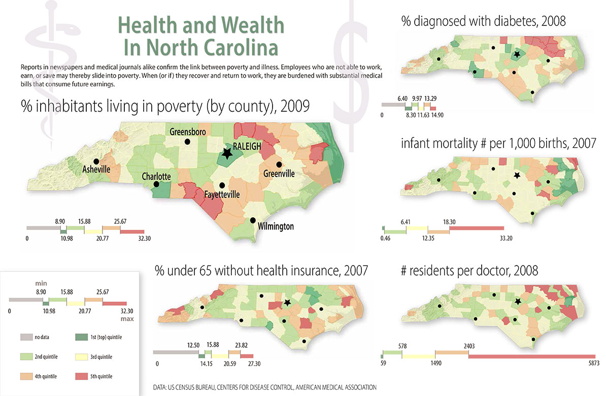
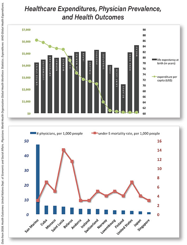
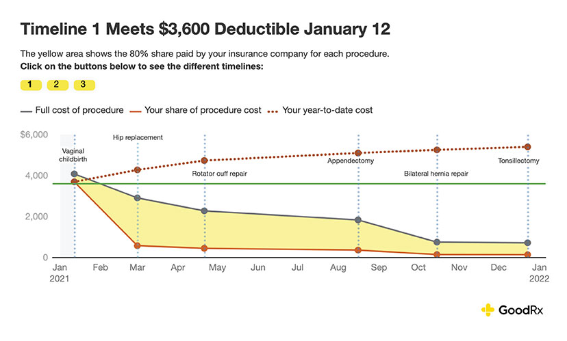
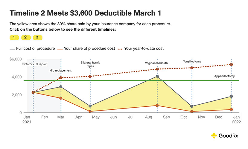
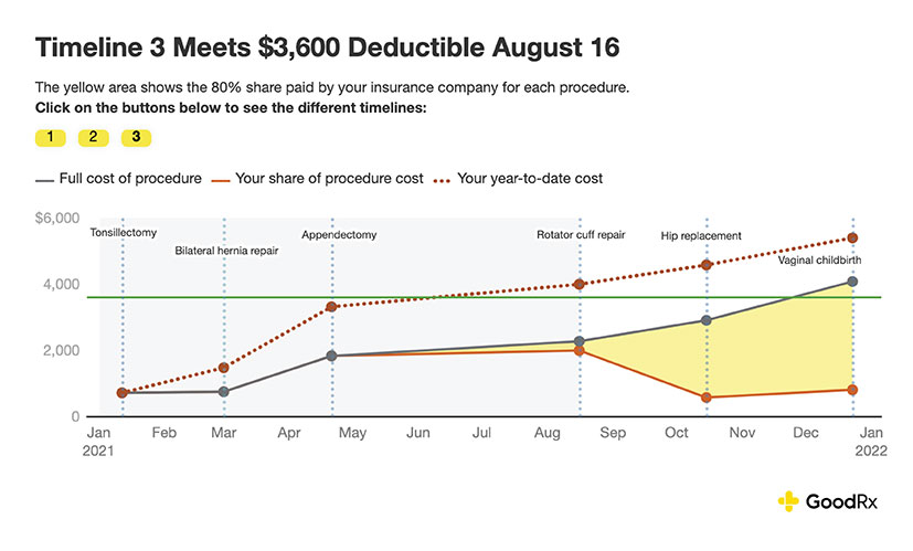
Healthcare & Insurance
Custom Concepts
Combining written information with visuals and actions makes it 70% more memorable.
Visual language helps people solve problems 19% more effectively.
Visual language has been shown to shorten meetings by 24%.
Synoptical Charts clients include some names you might know:

Hi, I’m Carrie. I’ll help bring your data to life.

I'd love to hear from you.
Whether you’re an entrepreneur or longtime executive, great infographics can promote your success.
-
Corporate Reports
-
Shareholder Presentations
-
White Papers
-
Recruitment Materials
Thoughtful, clear visuals help you make your case to administrators, taxpayers, grant makers, arbitrators,
or juries.
-
Legislative Impact Reports
-
Public Service Documents
-
Litigation and Mediation Displays
-
Crime Data Examinations
Upgrading presentations with charts and graphs
can bring more clarity to
the classroom or
conference room.
-
Conference Presentations
-
Classroom Explanations
-
Administrative Communications
Community
health advocates,
hospital administrators, insurance specialists, and medical non-profits
can benefit from streamlined charts and graphs.
- Population Health Presentations
- Insurance Plan Comparison Charts
- Healthcare Cost Analyses
- Benefits Utilization Reports
Got family history records or lifestyle data?
Let’s collaborate on something cool.
-
Lifetime Lookbacks
-
Travel History Maps
-
Family Trees
-
Influencer Metrics
My professional evolution reflects a natural progression from traditional editorial work to data-driven visual communication. At the beginning of my career I worked on numbers-heavy editorial projects like mutual fund rankings and tax guides. It was clear to me then that data lent weight and force to narratives, but I hadn’t yet fully embraced visualization as my core focus.
My journey from words to visuals has been in service of finding more powerful, accessible ways of communicating information.
In 2008 I founded Synoptical Charts, a solo consultancy that enabled me to develop my data visualization skills while working with publications and private clients. Two Visual.ly Staff Pick awards in 2013 validated this new direction, as did the steady stream of projects from my expanding clientele.
Later, my roles at NerdWallet, Health Monitoring Systems, GoodRx, and Forbes Advisor expanded my dataviz toolkit while deepening my subject matter expertise. At NerdWallet, as the content team’s semi-official visualization expert, I took delight in supporting colleagues as they analyzed their data and learned online viz tools.
I believe my two-pronged education has equipped me for this work. My literature degree deepened my storytelling instincts, while my master’s in information science provided the technical foundation for data interpretation. This combination enables me to see patterns and narratives where other people might only see numbers.
How I Work
